
Photoshop was never meant for UI design.
It just happened to be the most flexible application at the time and it became so widely adopted that even Fireworks wouldn't take off. However, Photoshop was a tool engineered for graphic art, image manipulation and photography—not web design. This has slowly become more and more apparent in the last couple of years as cross-device designs are becoming the standard. Assets were no longer favoured in pixels, they needed to be vector in order to be flexible. Photoshop was bloated with restraints on the design process so it wasn't long before there was decent competition.
Adobe solved many debilitating issues with Photoshop with the 2015 Adobe Creative Cloud update which ultimately places it back on the stage as a viable tool for UI design. Listed below are 7 developments and new techniques which impact me the most:
1. Artboards
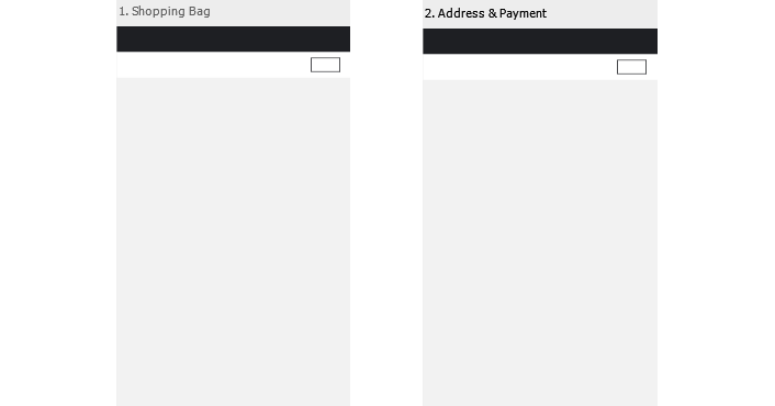
One of the worst experiences in UI design was the resulting mountain of .PSDs I would wind up with. Every page that needed designing had a separate .PSD, every .PSD had its unique file name format (e.g. CLIENT-04-account-3-myDetails-3-orderHistory-1-Order-150602.PSD) and all of this needed to be sorted into folders. Artboards resolve all of this. Now I can create multiple artboards in one file, view and work on them together. So long are the days of having to open up several .PSDs to view different pages; of mind boggling file name structures; of massive folders of .PSDs to sift through.
2. Device resolutions on Artboards
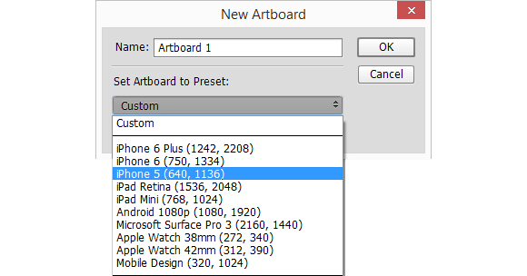
A clear indication of embracing the UI aspect of Photoshop is the fact that the Artboards themselves offer presets for device resolutions such as iPhone 5/6, iPad, Apple Watch, Android and Microsoft Surface. I can now comfortably delete that bookmark for “iPhone resolutions” when designing for mobile.
3. Using guides on Artboards
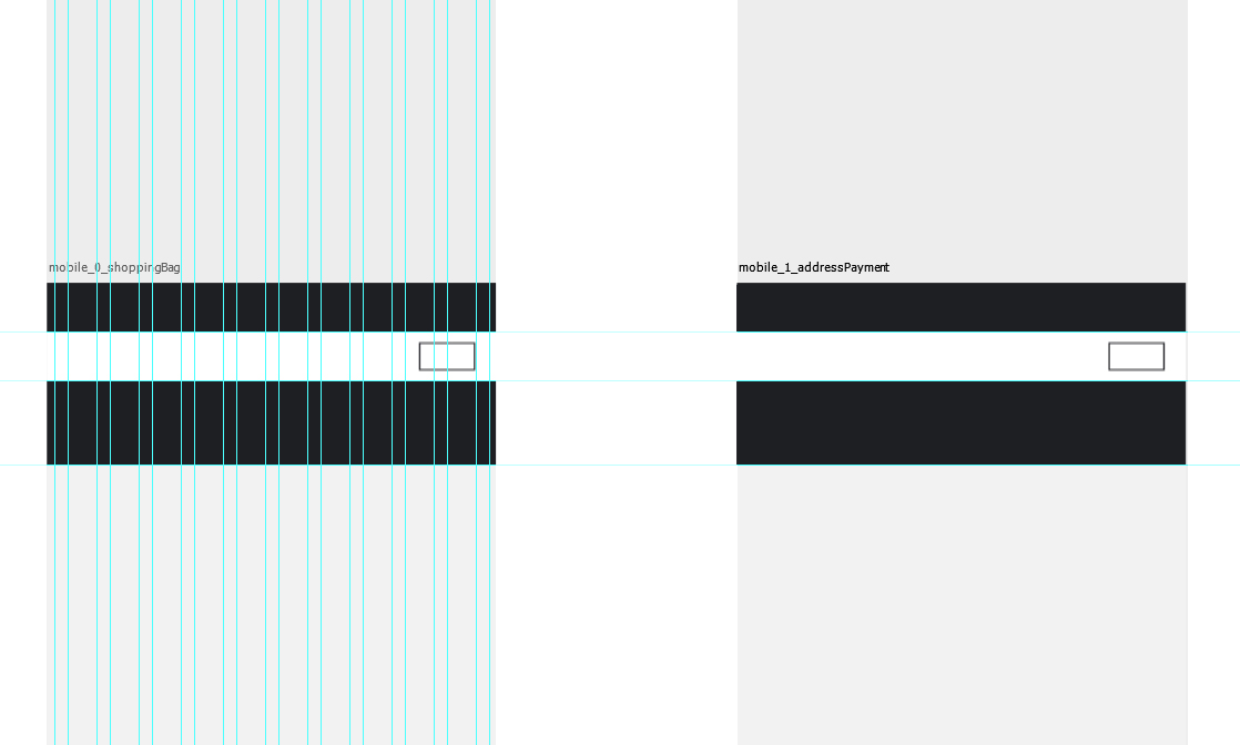
I love working with guides as it keeps my designs neat and organised to the grid. Artboards don't hinder this at all. If your guides are set as an Action, simply select the relevant Artboard and apply the guides. Business as usual. Working with Artboards also means you can now apply guides which align across multiple artboards allowing you to check every screen, all at once.
4. Right click to export
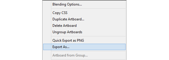
Can we have a moment of silence for all the lost time thrown at cutting up assets? This new Export As functionality on layers/artboards means that you can save your assets without the need to crop or slice. This also makes it extremely accessible for developers who might not be as fluent in Photoshop.
That isn't even the end of it. You can also select several Artboards at once and use Export As and they will save separately!
5. Using smart objects as master elements
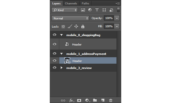
One of the most horrible things about working with multiple .PSDs is when it involves tiny changes to consistent elements (think headers and footers). I recall several projects where small changes had to be made to headers and footers across 20+ files. It becomes a mind-numbing grind going through every single file and applying a small change and trying to keep track.
Having your pages in one file on different Artboards means you can now utilise Smart Objects like InDesign Master Pages or like dynamic PHP files. For example, create a Smart Object for your header design, apply it across relevant pages then hit the gym with all the time you've just saved yourself.
6. Multiple layer styles

Although it's become outdated, one of my earliest experiences with Photoshop was designing skeumorphic buttons. Layer Styles were amazing in its flexibility for highly detailed buttons but I would need to use several layers or improvise for something as simple as wanting an inner and outer 'Stroke'. The update included the ability to stack multiple Layer Styles with a “+” button which ultimately simplifies layers inside a .PSD. Eve also discovered that layered styles will allow for multiple shadow effects which represent real shadows more accurately and is a prominent element of material design.
7. Adobe Device Preview CC

Perhaps the most exciting application added to the workflow is Adobe Device Preview CC. Previously, in order to see designs on a device for reference, the process required saving the design as an image then sending the file to the device directly and opening it up as a photo while zooming arbitrarily. This app now allows you to connect to the application you're currently using and view Artboards on your device at default 100% zoom. As if that wasn't exciting enough to pee myself, any changes you make are updated LIVE on your device.
These updates combined lifts a significant burden off the workflow which allows me to focus on designing great UI. Photoshop still has a way to go to but this update is a big step forward for embracing it as a bonafide tool for UI design. It's an exciting time to be alive!
Read the full release notes from Adobe here.


