The making of our Brian Robinson collaboration
As an animator, it has always been a dream of mine to bring people’s artistic vision to life – just like how Dali worked with Disney to create “Destino”. And as I’ve moved into art direction, my interest has evolved into exploring how immersive technology could be used to transport audiences into a specific story or perspective different from their own.
Recently, we had the chance to work with artist Brian Robinson and the RISING Melbourne exhibition team to bring his work to life into an immersive projection experience. Like most collaborative projects, this was an incredibly rewarding and interesting process.
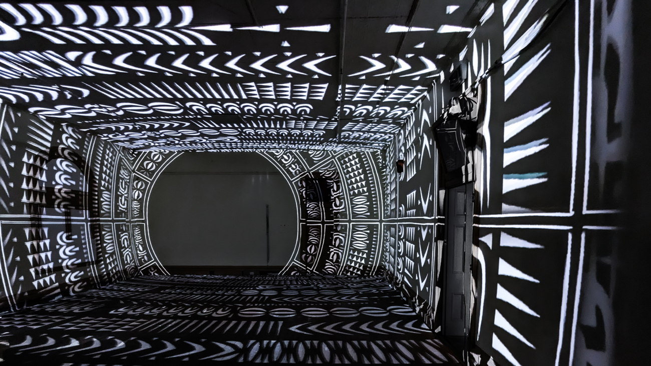
In this article, I’ll take you behind the scenes and share some of what went into creating the final artwork – Zugubal: The Winds and Tides Set the Pace.
Get to know the work
The first step in a collaboration like this is understanding the artwork, and more importantly, the vision behind it. To do so, I usually go through three main phases:
Find the pieces
Whenever I’m working with someone else’s art, my first step is to break it apart. Why? Well, by breaking an artwork down to its individual elements we can begin to imagine how it might transform in a new medium. We start to see how things could be layered with each other, or be relocated to create a sense of flow.
This was particularly important for this project, as our immersive experience would be made out of three of Brian’s artworks. We would need to find a way to bring them all into the same universe, which meant cutting this up and putting them back together again.

Learn the lore
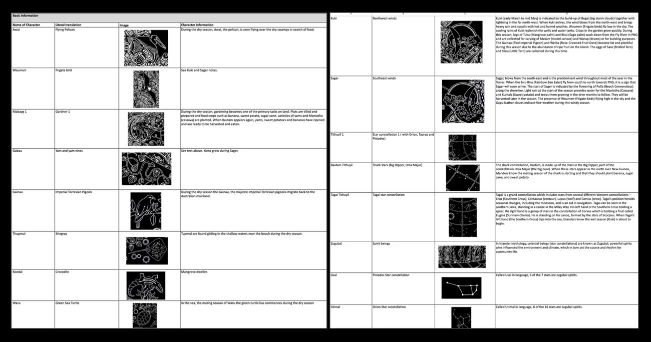
Once you know what you have to work with physically, it’s important to understand the conceptual basis as well. In this case, that meant learning about what each character meant in the native language, and what their backstory was.
Working together with Brian, we mapped out the lore and backstory of each element in the artworks one by one. This helped me understand the purpose of key visuals, and helped Brian develop the direction to take advantage of the new medium.
Map the narrative
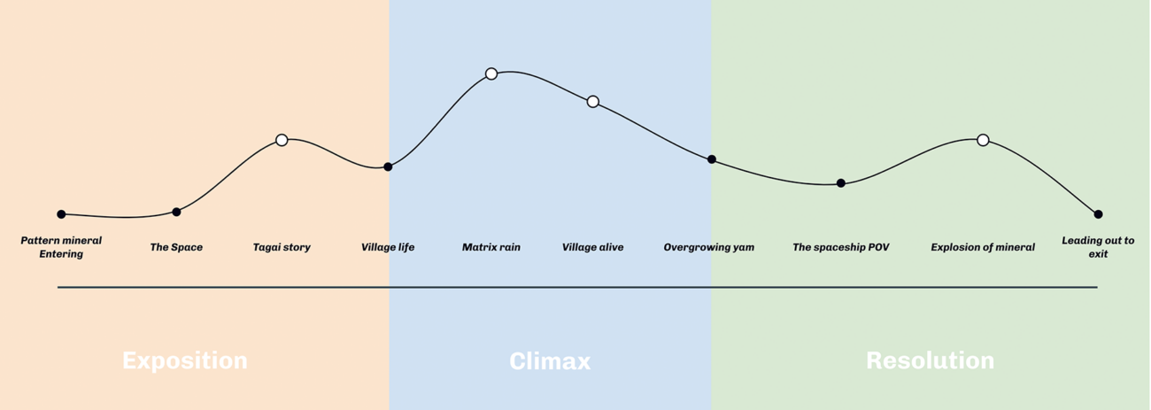
With the puzzle pieces of the artwork, and the lore to back them up, it was time to think about assembling them into a compelling narrative arc. Mapping the journey like this would make sure the audience wouldn’t feel too overwhelmed when they arrived, or too disoriented when they left.
Once we were happy with the narrative arc, Brian went away to develop the script. When he had a first draft, we came back together to iterate. Then I did some voice over recording tests and editing to make sure the flow of the script and its pacing felt right for the story we were trying to tell.
Understanding the physical space
When you’re creating an immersive experience in the physical world, it’s not just the artwork you have to worry about. It’s also important to take some time to understand the space you’ll be working in.
Know your limits
Since the artwork would be projected within a heritage building in Melbourne, there were a number of physical limitations we had to work within. We had a set amount of space to work within, and no ability to do things like build walls or move windows.
And because the artwork would be part of the Rising festival, we also had foot traffic to consider. For example, the projection mapping wouldn’t look good if there were too many people in the space at one time. We worked with Rising and Twisted Pixel to figure out the best layout for the room, and how we could work the key architectural elements into the work without interrupting the flow of the story.

Consider the audience
Understanding how people would walk through the experience, and how much they would be able to see within the limited layout gave us a great foundation. Next it was time to think about the experience the audience would have – and how we could make it as good as possible.
Working with Brian we came up with a set of rules and beats that would drive the experience. Thinking about the user experience and foot traffic actually opened up some opportunities. For example, we ended up using the animations to draw people through the space.

Mapping the animations
Believe it or not, a lot of the work involved in animation comes in developing the storyboards. Over the years I’ve found that if you invest in this step, everything that comes after is much easier.
Juxtapose the moment
After setting rules and prepping all of our assets, it’s time to begin storyboarding. This step isn’t just about capturing the beats of an experience; it’s about imagining how they will connect.
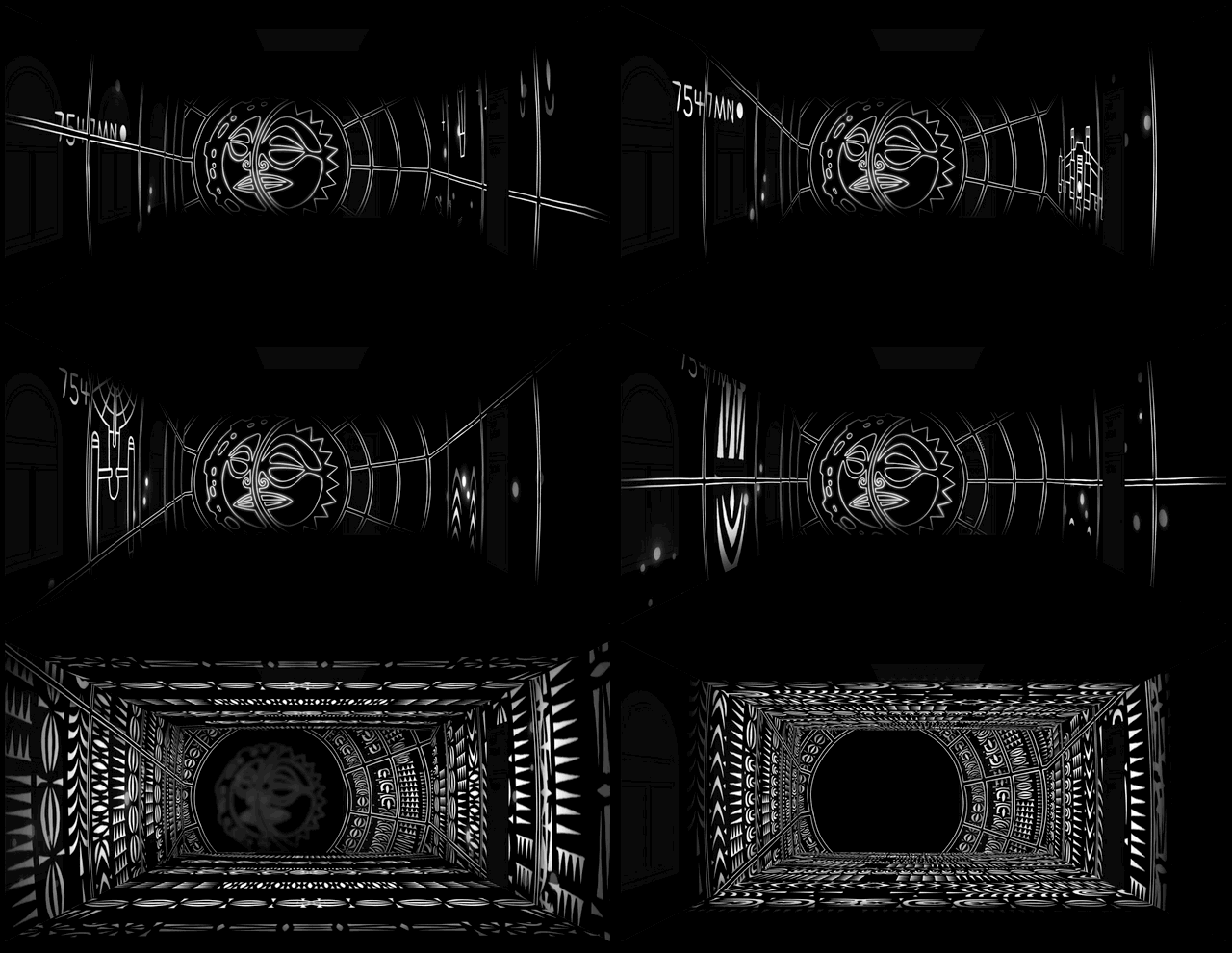
Having worked so closely with Brian on understanding the artwork and mapping the narrative, I knew that a sense of contrast would be key in creating this piece. Through the storyboard I was able to map the build from calm anticipation through to big visual payoff. This would not only satisfying to watch, but would also help us create the right mood and feel for the story.
Embrace the nerd
While I was breaking down Brian’s work, I noticed there were a lot of hidden Star Trek and Star Wars references scattered throughout his art. And as a secret nerd, I wanted to leverage that in the animation. So throughout storyboarding, I looked to incorporate camera angles and transitions that would hint towards the sci-fi references in Brian’s work.

Look to nature
While dramatic movement was an important part of this artwork, we also wanted to introduce a lot of natural movement. Brian’s artworks touch on concepts like time, wonder and curiosity, and I wanted this to shine through the animation too.
Drawing inspiration from movements that would feel natural and familiar to our audience would help them feel welcome in the space. It would also allow us to lead them to different areas of the space, really taking advantage of the immersion of projection mapping as a medium.
Patterns that move like a curtain opening.
Rain-inspired depth of field blur to create a clear focal point.
Placing visuals around a ‘black hole’ to invite audiences to walk forward and take selfies.
Bringing the work to life
With all of the pre-production done, the actual animation process was – dare I say it – almost the smoothest animation process I ever did. When we got onsite there was some final tweaking, repositioning and grading, but with solid plans it really took no time at all to perfect the final piece.
This collaboration ended up being a lot of fun. Working directly with the artist and curator helped me to understand their point of view and vision from very early on in the project. It’s a bit corny, but the process for creating this work was a bit of a metaphor for what I was trying to do with it: the more we understand each other’s stories, the more able we’ll be to create not just a better artwork, but a better world.
Zugubal: The Winds and Tides Set the Pace is just one of the artworks featured in ‘Shadow Spirit’, a First Peoples exhibition in Flinders Street Station’s abandoned rooms. The exhibition is now open from the 7th of June to the 30th of July, with tickets available at https:


