We live in a material world
the objects we use, the technology we embrace and the physics that govern our universe – these are some of the fundamental properties by which we interact and understand reality. If the design of yesterday was based on flat simplicity, the visual language of tomorrow is being driven by a new material style of design that references the world. This style, material design, is the future of web because it addresses the shortcomings of flat design and over-detail of skeuomorphism.
If we interpret design by our knowledge of the universe, then it makes sense that good design is one that draws from the physical universe. This is why James Turrell is so important to design, and beyond that even. He may be studying principles of nature but these same principles still apply to the digital world. The master of light and space as many people call him, Turrell understands that to speak to the viewer, to be able to shape and twist an experience, you first need to understand perception.
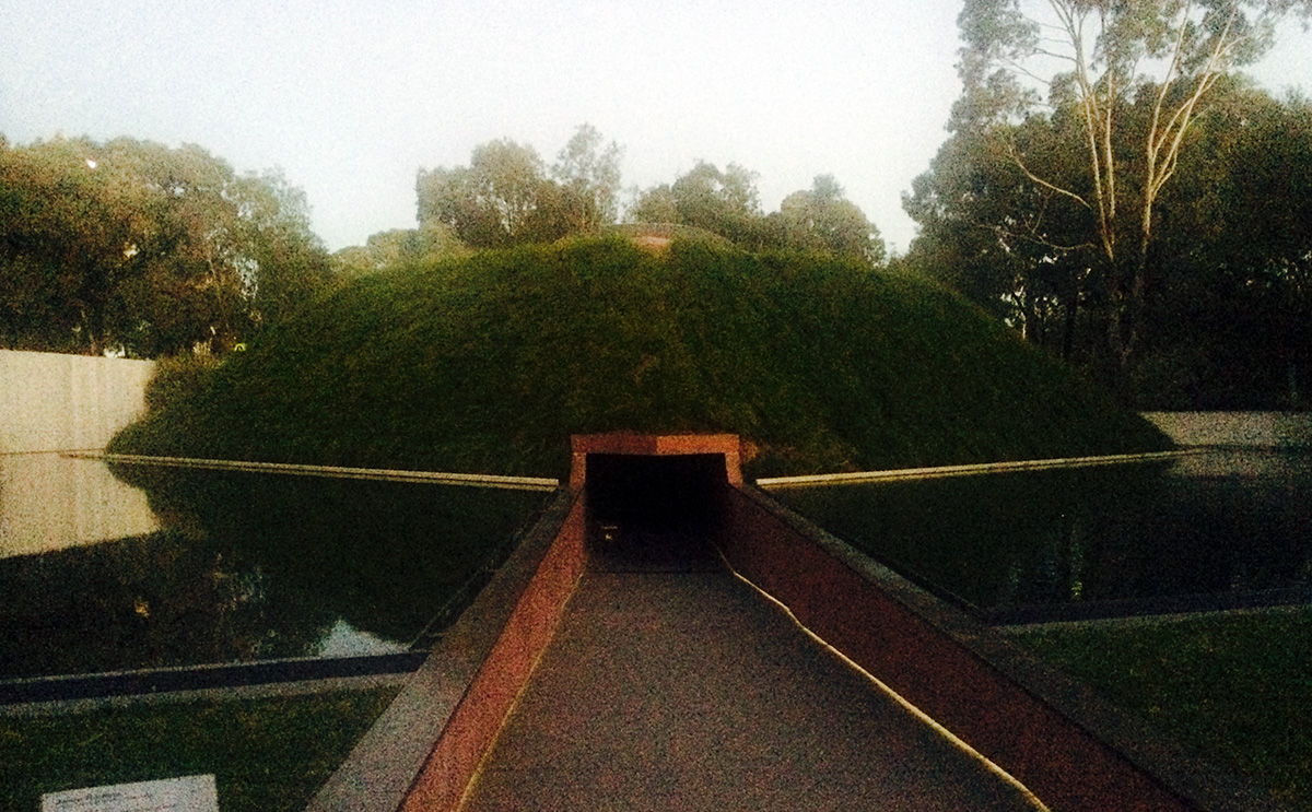
One such example of this is Turrell’s famous Skyspaces. With over eighty around the world, his Skyspaces are naked eye observatories where people can view the sky through a precise framing. By doing so Turrell is able to guide our focus to reveal what he refers to as 'perceived reality'. Where on most days we may look up at the sky and not give it a second’s thought, in Turrell’s Skyspace you will look and marvel at it’s wonder.

For Turrell, the skill in working with light as a medium is in its perceptual psychology, or how it manifests itself to the viewer. It is not about his vision but rather his invention facilitating your experience. Like the overarching ethos of material design, he puts the user first.
Anyone venturing into the world of material design can similarly see that it is founded on three underlying principles, all of which can be found to some degree in Turrell’s work:
- Material is the metaphor: We may be designing in a virtual space but the surfaces and edges of the physical world are all visual cues that users understand, and that we as artists need to adhere to.
- Driven intention: The screen is your canvas so focus on the immersive experience from the perspective of the user and work towards a core functionality with purpose and intent.
- Meaning in motion: What the user does is the inflection point that transforms the whole design, so consider movement and make it meaningful and appropriate.
At Turrell’s skyspace, the simple act of witnessing the sky, particularly at dawn or dusk, turns into a moving art work that accentuates the influence of time, motion and function. It is his proof that even the simplest and most natural of mediums can be used to demonstrate perception.

A large portion of today’s design is impelled by the demands of the digital era; user interfaces, website pages and apps are all part of everyday life just as much as billboards, radio and television. Too often as web designers we are stuck inside a digital canvas, caught up in our own agendas. In doing so it is easy to forget that we are not creating for ourselves but rather for an audience which has their own set of beliefs and familiarities. At the heart of all of Turrell’s work is the user experience, because he knows without this an artist's design is nothing. We would do well to learn a bit more from James Turrell and others like him.
My work is more about your seeing than it is about my seeing, although it is a product of my seeing.


