Home loans have been around for longer than my lifetime. It is an industry governed by the safety and security of family doctrine; buy a home and your future is safe. Operating on this presumption the industry hasn’t exactly changed with time, it hasn't needed to, and this is reflected in the quality of work being output – conventional, safe and unchallenging.
It is for this very reason that when Adrian Lee, Managing Director of the Resource Financial Group ('Resfin') asked us to remake his website, my initial reaction wasn't exactly to fall off the chair in excitement. Working with Adrian in the past I knew him as a pragmatic man, for him it’s less about what you spend and more about what you get in return. I therefore knew any website we'd be making would be dictated by this philosophy.
But then the unexpected happened, the conversation went something like this…
“Tash I need a new website.”
“Cool, do you want to send me a brief?”
“Well… I realise every time I tell you what to do it comes out sh*t. So this time I’m going to let you do whatever you want.”
Complete trust from a client is a rare thing, it takes time to build and a number of successful projects under your belt. We were ecstatic that Adrian gave us creative freedom and we set out to make something that was special.
Three months later and I can happily announce the launch of the Resfin website – www
While we are proud of what we’ve created in its entirety, there are three specific aspects in particular we loved working with on the Resfin website:
1. The artwork

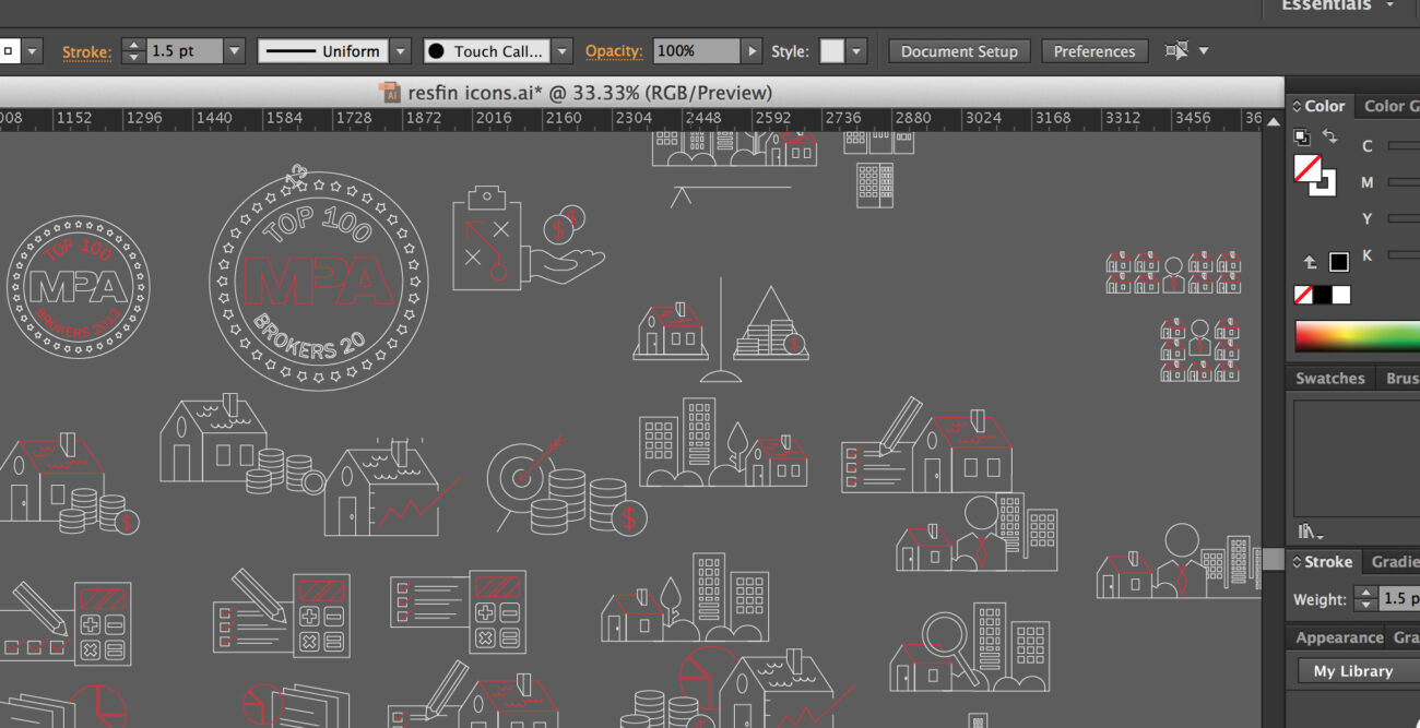
How easy is it to overlook one of the fundamental joys of being a designer – the ability to create art. The time we spent on the iconography of the Resfin website was countless but by combining three staple brand colours we created a minimalist iconography palette that helped to shape the elegance of the website.
2. CSS3 + SVG animation

Using SVG or Scalable Vector Graphics allowed us to create icons that were drawn into the canvas as the user was exposed to a certain area of the screen. Similarly, by playing with CSS3 and HTML5 we were able to create smooth animated transitions to add a new dimension to the website. This made the site highly dynamic and engaging for navigating through. With uptake and support across all the major browsers for SVG and CSS3, it was great to be able to utilise these new technologies in an industry that traditionally played it safe.
3. Material design

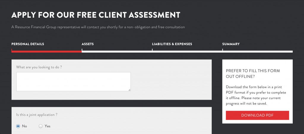
We may be designing in a virtual space but we live in a tactile reality, where the surfaces and edges of the physical world are the visual inspirations for design. The Resfin website is our first foray into material design and an interesting step into the direction of digitised forms for the mortgage broking industry. And, I don't just mean forms for lead conversion but forms that make the home loan application process easier for users. One of our goals in the future is to collaborate with Resfin to improve these processes even further.


