

Love your forms
Forms. They don’t exactly inspire excitement. The general experience most people have is that they’re arduous, annoying and inconvenient. A bit like standing in a long queue. The difference is that, for customers looking at a form on your website, there’s nothing stopping them from simply closing the tab.
Forms may not be the most exciting part of your website’s design, but they are arguably the most important. The form is where anyone looking at your site becomes Tracy or Arun, a real person with a real interest in getting in touch with you or your services. After all the hard work you put into building your website, the form is the final hurdle, before you can form a personal relationship with an interested user.
Looking through a business lens
As a designer, when I hear ‘sales conversion funnel’ my brain does the equivalent of crashing into the couch and resigning for the day. But in all seriousness, re-thinking how each aspect of your website creates an effortless flow for your users to get from Interest, to Desire, to Action will make a world of difference.
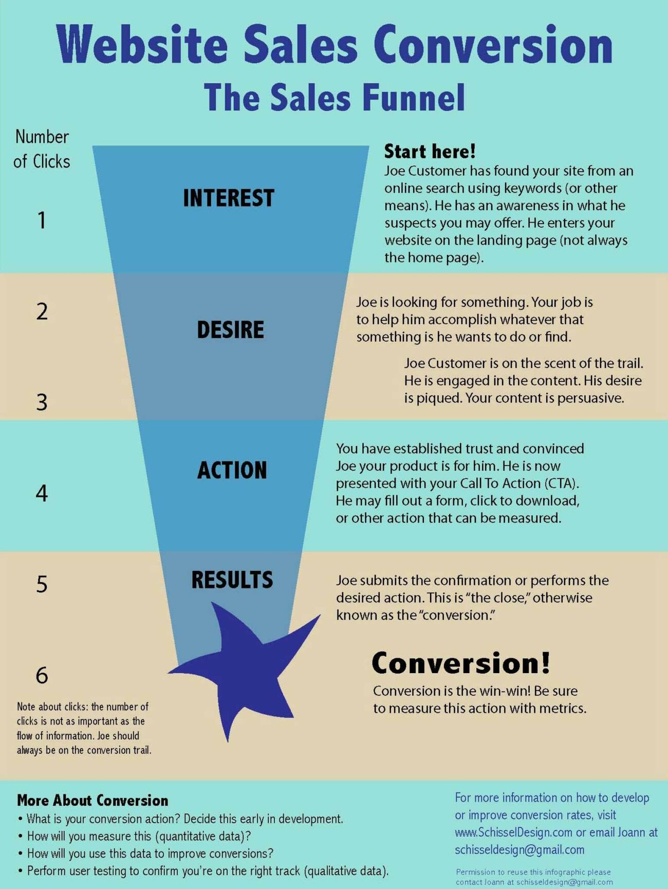
The funnel, as the word suggests begins wide – from a large and broad audience who stumble upon your website – and drops off into the most narrow – typically where your most interested customers will reach forms or call-to-actions.
In most websites this final action would be the submission of a form, for example a shopping cart, email subscription or contact form. So why might so many interested potential customers not make it through to Conversion?
1. Looks do matter
As a user, trust is key to submitting any of your personal details online. A big red flag for any user is that a form looks outdated and uncared for. Unfortunately, even if the rest of your website looks smashing, reaching a form that looks like it has digital cobwebs can signal that their personal information will likely be treated the same way.
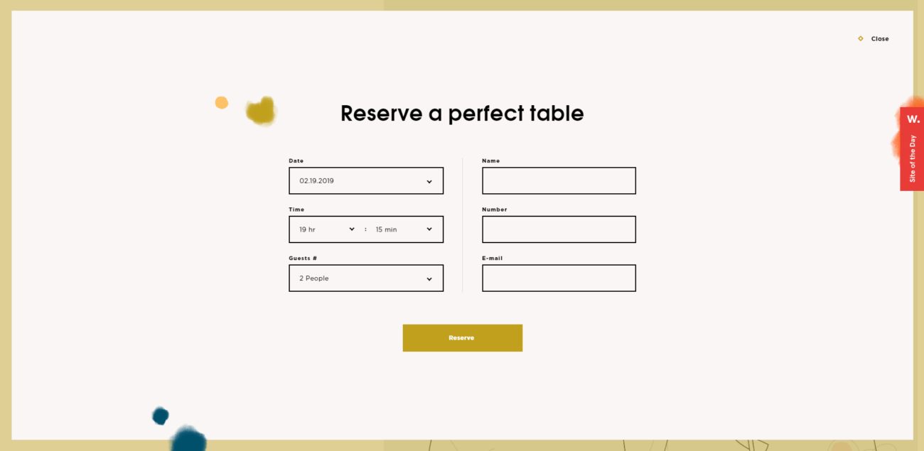
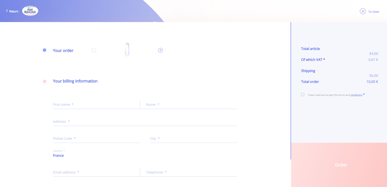
Our friends at Aus Tradie Websites have designed some great forms as part of their tradie website designs that aim to look great on mobile and tablet (as well as desktop-sized devices).

Designing a form (whether its contact, checkout or anything in between) doesn’t have to be glamorous. But keeping it clean, clear and up to date will help establish reliability and trust.
2. Seek to be understood
To maintain trust, and keep your users from resigning in frustration, your form should be crystal clear. This includes the wording you use in the copy, as well as error and validation messaging. Who is your target audience? How will they respond to your labels and messaging?
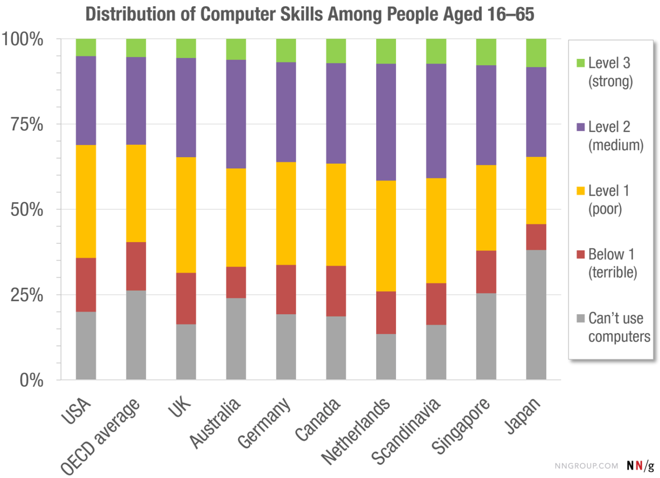
You might be surprised to find the percentage of your users that don’t have your expected level of computer literacy. Norman Group looked at computer skills in over 33 rich countries and found that only 5% had high computer-related abilities, and only one third could effectively complete medium complexity tasks.
To prevent alienating two thirds of the population, keep it simple. Check out these tips from UX Collective to help create more clarity in your forms.
3. Short is sweet
Your forms look good, and are easy to understand, but your potential customers are still leaving? The general rule here is to only ask what is absolutely necessary. No-one likes seeing a massive to-do list, and that’s what a long form can feel like.
However, sometimes you will have a long list of essential questions. How can we change the experience to make it less arduous? A tip here is to pace your questions, either by adding headings or separating them into related portions or shorter stages.
Forms can be fun!
So we’ve understood that with a little love and care, we can give our customers faith in our business and reason to connect, and ultimately improve conversion rates on our websites. Let’s take it that extra bit further. I’m going to say forms can be fun. Yes! Forms can be so delightful that they encourage that customer sitting on the fence to dive in and engage with your brand.
Hear me out.
Remember those online quizzes that told you what your Harry Potter patronus was, or which Disney character you’d be? Whether you shared your results on Facebook or closed the tab as soon as you find out you’re a lizard and hope no one saw you waste 20 minutes, there was a reason you sat there and answered all those questions: you had an incentive, you’d be rewarded for your time with the results of your quiz.
Entire companies have been made through the finessing of this reward mechanism. Take Typeform for example. Typeform is a web application that believes making forms beautiful and interactive will help people enjoy filling them out. Not only is each question presented one at a time, but the motion and animation gives the user a little visual reward.
You can also incorporate visual gratification into your forms by providing visual validation. Notice the psychology of the symbols you use. For example, say ‘thank you’ with a tick and a button to go back to home, rather than a cross to close the dialog box. Crosses psychologically trigger the notion of extra effort, while a tick symbolises completion and leaves your customer feeling better about the form they just completed.
Go the extra mile
You can have so much fun with forms, they don’t have to be boring. Forms can be the first personal digital touch point on your website, between your brand and your customer so make it a good experience. And if you want to go that extra mile, make it special and memorable.
Here are some beaut contact forms that I definitely spent too much time playing with:
That’s all folks! I hope you’re armed with some inspiration and are now able to look at forms in a whole new light.


