
The creative process that gave life to an anamorphic illusion


The revival of live events
Kia Morphia came to us at an unexpected moment. COVID-19 had turned life upside down. This was our chance to be part of the revival of live events in Australia – and for me to test my art direction skills.
Until we received this brief, a lot of our experiential marketing and live event work had been paused because of the pandemic. The S1T2 team had transitioned to working from home. And I was moving from being lead animator to art director – even more challenging with the remote working situation.
But even without these challenges, this would have been a very exciting brief. We would be one of the first teams working with Kia’s new branding – an opportunity that offered huge creative potential.

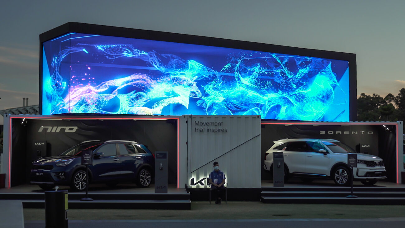
Kia Morphia
Stunning anamorphic illusion introduces Kia’s new brand at the Australian Open.
So today I thought I would give you an insight into my creative process while working with the new Kia branding, and how I navigated collaboration in this new post-COVID world. Hopefully by the end you’ll have an idea of what it takes to execute on an experience that straddles brand promotion and artistic vision. It’s a challenging ambition, but one that I’ve really enjoyed.
Understanding the Kia Morpia project
The brief for this project was to create eye-catching visuals that would resonate with and unleash the bold new attitude of Kia’s refreshed brand. While COVID-19 concerns meant interactivity was off the table, we were determined to create an immersive, story-driven artwork. We saw this as an opportunity to create a story that inspires, expanding the Kia universe while being a teaser for what’s to come.

What was interesting about this brief for me was how to tell the core story of Kia’s new branding through movement. As an animator at heart, the meaning of movement is very important to me. Not only can it communicate universally; it can often speak louder than words or static images. We were very lucky to have the chance to create something for people to feel and interpret a story from different perspectives.
We wanted this experience to be stunning yet an open book. For us, it was about making people feel the message, rather than simply receiving it. When watching each of the three visualisations, audiences should feel how strong and graceful each movement is against the container. With the anamorphic display, we would create a glass illusion window; something that gives the audience anticipation about what is to come for Kia.

Working with a refreshed brand
For me, one of the coolest opportunities for this project was to represent Kia in a new light. It’s like being part of the ‘makeover’ scene in a teen movie. From working with Kia over the past two years and then working with them again this year, it was exciting to use all my creative energy to help elevate the Kia brand and represent it well at the Australian Open.

Because the Kia brand was being launched at the Australian Open, we were one of the first few groups to use this new branding at a live event. The brand was so new that very little R&D had been done in how the brand would react to movement or in CG renders. It was up to us to take what Kia had from their brand refresh and set some new rules for colour and movement style that would work with the installation we had planned.
The new Kia branding is a lot more mature than previous years. Our other activations with them were all about becoming part of the car. This time around, our execution had to have a wider appeal. Our installation this year needed to create a subtle yet powerful punch to sell the feel of the new Kia branding to our audience.

Delivering a compelling message
When we got this brief, it was very broad but very specific too. Kia knew they wanted to showcase three different facets of their brand motto – ‘movement that inspires’. One would relate to the Australian Open and Rafael Nadal, one would promote their range of electric cars, and one would resonate with their mature, nature-focused new branding.

First up for us was narrowing down what was most interesting about each of these stories, and how we could elevate the visuals to push this even more. If we’re showing the speed of Nadal’s movement, how can we use the style of a long exposure photograph to express his gracefulness? How can we create the illusion of a car in a cargo container to make the digital display feel like it’s part of the physical activation? How could we use physics simulations to play with water and gravity, creating even stronger anticipation for the force of a wave?
Add to this the challenge of working with forced perspective. These stories would need to make sense at the ‘illusion point’ – the one angle where the 3D anamorphic illusion aligned – as well as from individual angles. I tried to separate my brain into two canvases: one for the main visuals at the illusion point, and another over the top of this to make sure the activation looked good from every angle.
Getting the right foundations
Whenever we’re trying to tell stories with movement, the storyboard phase is crucial. The storyboard for an installation should be clear and able to communicate for itself. For me, if the storyboard couldn’t portray the core stories we were trying to tell, then the VFX and editing later in the process wouldn’t fix it either.

For this project, the storyboards were even more important. The installation would communicate through visuals alone. Those visuals needed to pull their weight. We spent a lot of time editing the storyboard back and forth with the client to make sure we were getting the story right.
While we were working on the storyboards, we were also doing R&D into the technology behind each effect in parallel. This process is actually very important and quite interesting. In some meetings, the storyboard team would end up inspiring the R&D tech team, while in others the artists were inspired by the simulation experiments of the tech team. Art inspires science, and science inspires art.
Balancing 2D + 3D visuals
The first visualisation we created for Kia Morphia was ‘Tennis in Motion’ – an animation inspired by the precision and power of Rafael Nadal’s movement. We were inspired by the speed and challenge that Nadal has to face during tournaments like the Australian Open. In particular, we wanted to portray how he challenges himself in every game.
Using 2D footage from the previous year, our plan was to choreograph Nadal to be playing against himself. Given we were interested in showcasing the speed and precision of tennis, our art direction prioritised changes of space – contrasts between the rapid speed of Nadal’s movements and their slow motion effects.
This animation was all about capturing the energy of Nadal and the Australian Open within the context of the Kia brand. So we focused on the movement. We used 3D particles to give movement a physical presence. Sand-like particles drag behind Nadal, following the motion of his body. Then, the chaotic energy of the ball created a ripple effect across the room. The whole installation’s energy was designed to feel like the adrenaline rush you get while watching an actual game.
Using colour to create emphasis
‘Tennis in motion’ was the only experience out of the three we were creating that was inspired by the nature of the Australian Open rather than Kia’s new branding. The colours we used were those of Nadal’s actual outfit and the blue of the Australian Open courts. Through our art direction we tried to use these colours to our advantage. We used them not only in the background and 2D footage, but as the basis for the particle visualisation as well. We also made the lines of our digital tennis court reflect back the colours moving through the space, creating deeper 3D space so the particles would look more realistic.

One of the challenges of this experience was how to move smoothly between the core content and the Kia logo. There was a real possibility that moving from the Australian Open inspired colouring to Kia’s brand colour would feel jaring for the audience. How we solved this was by adding a transition in between that revealed the Kia logo. This animation helps gather the experience as a whole, and was reused across the other two experiences as well.
This challenge of balancing the potential of the new branding against the requirements of our content came up again in our third experience, which was inspired by nature. Kia’s bold red wasn’t really appropriate, so we had to do a lot of R&D into colour, room style and movement to be able to link the two together.
Harnessing the power of light
The next piece of Kia Morphia content was titled ‘EV Evolution’. The idea with this visualisation was to explore the progress of movement through electric vehicles. As well as launching their new brand, the Australian Open was an opportunity for Kia to raise awareness about their innovations in electric cars. While none of the team have driven an electric car before, we knew that we wanted to explore the purpose of how these cars are built, and what a futuristic vision of Kia could be.

The movement and styling we wanted to capture was ‘light’. Not just ‘light at the end of the tunnel’, but ‘light as a feather’. We wanted the animation to explore the futuristic nature of electric vehicles as well as their lessened environmental impact. Knowing this, our art direction focused on having a dark environment illuminated by thin rays and particles of light.
Our art direction was all about introducing the future, rather than documenting it. We chose an abstract style, so that the cars would not be revealed fully, but highlighted bit by bit as the light travelled by in a simulated wind tunnel. We used light to expand the room, reveal the car, and then give a physical shape to the energy that runs through it. Having experimented with this kind of futuristic aesthetic in our recent work with the Macau Grand Prix Museum, we knew this would create an immersive, sleek vision of what Kia is developing for the future.

Controlling pace + perspective
The cool part of this animation was how we used particles to animate and extend the perspective to make the container seem deeper than it is. This created the illusion of a long, futuristic wind tunnel for the car to be displayed in. it also makes the whole activation feel like a futuristic portal, especially when viewed from the right angle for the anamorphic illusion to really have an impact.
We also choreographed the car so that it would always move forward against the light particles. Then we designed the particles to have three levels: first, to generate and travel straight towards the car; second, to flock and hug the shape and structure of the car; and finally to absorb the car and help it disappear gracefully.
Creating art with nature
The final experience for Kia Morphia was ‘Brand Movement’. This visualisation would be the most aligned with Kia’s new brand, aiming to show the power of natural movement that inspires them. We wanted the movement to reflect nature, while having a huge, powerful impact. When visitors stood at the illusion point, they would feel awe and anticipation; as though the waves were about to crash right over them.
We knew that we wanted to use movement to create a sense of anticipation. While we wanted to create an epic display for audiences, it was important that our art direction didn’t try to force the nature of water. The idea was to use gravity and wind in the container to achieve an organic display of nature.
Using a physics simulation within a digital recreation of the shipping container, we tweaked the beat of the visualisation – from the slow reverse gravity at the start through to the chaotic crashing waves at the end. We wanted to create water particles and movement that looked strong yet moved naturally. Mind you, this was not easy when it came to the actual animations!

Making the tools work for you
I started out as an animator. So even when I’m art directing, I’m always thinking about how to actually create what I’m conceptualising. It’s actually a core principle of who we are at S1T2 – a team with creative ideas and the knowledge to execute them. In this case, we were working with partners at MISTER to actually bring the ideas to life. Nonetheless, from the very beginning I was investigating what was technically possible and how to make it look great.
As mentioned, we tried our best to use a naturally generated movement of water for this visualisation. With that in mind, we decided to use a water simulation in a box to create that effect. While we defined what the waves should look like, and the feeling they should foster, none of the water is following a directed path. It was created purely by gravity and physics simulations, rotating and flipping the box to affect the water. That way, we would get the real impact of water against the glass, making the final visualisation even more compelling.
Learning through the process
As you can see, there were a lot of technical design elements that we could potentially play around and have fun with throughout this project. But we focused on coming back to the core problem: how we could tell a compelling story. In most of our work, we’ve found that the best stories are told not just through the big visuals, but the small choices. Each water drop or lighting choice plays an important role in immersing audiences in the world of a story.
In the end, a lot of our collaborative meetings were about asking ‘why’ – something I’d definitely recommend any designer or art director to incorporate into their process. I always find it satisfying to know that we’ve explored the options and that we’re on the right track. For this project, this helped us bring something new to the Kia brand, while still feeling a part of their larger brand and story.
If you’ve made it this far, I hope you’ve found this article helpful in understanding the artistic process. Even better, I hope it inspires you to continue working creatively – whether you’re at the office or working from home during this tough time.
For more about this project, check out this article for a more comprehensive view. And don’t forget to join our community of artists and creatives by leaving your email below to receive the latest insights and updates from the team.


