ADIA Website
Modern geometry + WebGL create distinctive online brand.
- Abu Dhabi, United Arab Emirates
When the Abu Dhabi Investment Authority (ADIA) were looking for a new website, they wanted something different. Something that, like ADIA itself, would go beyond what you would expect from a sovereign wealth fund.
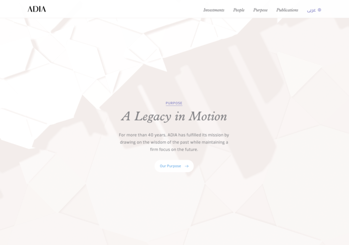
Together, we embarked upon a journey to reimagine their brand principles – wisdom, purpose and endurance – into a captivating digital brand capable of presenting the best of ADIA to the rest of the world. Echoing traditional Arabic geometry with a modern yet elegant twist, the new ADIA website design’s distinctive WebGL animations and subtle interactivity create a unique, ownable brand that brings the story of ADIA to life both online and offline.

Pitching process over product
Pitch + ProposalWhen we were asked, alongside over 20 global agencies, to pitch for the new ADIA website, we decided to take a risk. Instead of selling the finished product, we sold our process. We focused on opportunities, rather than designs, holding true to our belief that the best solution would have to be built together, through collaboration and iteration. It was an approach unlike any of the other agencies, and it paid off.
Together we embarked upon a journey to craft an online embodiment of the ADIA brand…
Redefining ADIA online
Original BriefWhen we first started working with ADIA, the brief was loose. They wanted a new website – and refreshed brand – that would communicate and embody who they are and what they do. But they weren’t really sure what that would look like. Our job was to help them find a path forward.

The idea was to craft a brand and website design that would balance the creativity and innovation of ADIA’s future with the understated elegance of their past. Together, we would reimagine the principles that have seen ADIA grow to one of the world’s largest sovereign wealth funds – wisdom, purpose and endurance – into an interactive digital brand capable of presenting the very best of ADIA to the rest of the world.
Understanding the problem space
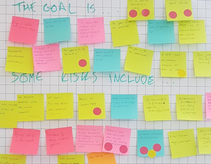
Discovery PhaseWe began our work at ADIA with a Discovery Phase in Abu Dhabi. The goal of this phase was to figure out not only what was needed, but what was possible. We wanted to fully immerse ourselves in the world of ADIA, gaining an understanding of the scale and complexity of the institution as we began to conceptualise how we could use technology to tell their story.
We tailor Discovery to suit the needs of each project. In this case, it involved an intensive, collaborative process spanning in-depth desk research, in-person workshops with the ADIA communications team, interviews with staff across different levels of the company, and immersion in the culture – not just of the institution itself, but the context in which it exists.
Embodying the brand
Art DirectionWhile our initial ideas for the ADIA website had been fresh, modern and very much in line with current website trends, after Discovery we knew a different approach was needed. The challenge we set ourselves was to redesign the ADIA brand in a way that was both timeless and relevant. This balancing act took many iterations to get right, but was really the only choice when it came to properly representing a company that is a living legacy of its people.
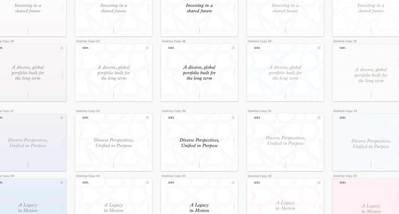
Drawing on ADIA’s history and the cultural context of Abu Dhabi, we set out to craft an art direction that echoed tradition with a modern twist. The result was a design system that balances bold innovation with understated elegance. It communicated not only the rich history of ADIA, but the dynamism and creativity of its evolution. And it provided the flexibility to live up to these ideas in that it can be iterated upon and improved over time as technology evolves.
Exploring endless possibilities
Creative ExplorationThe next step was to explore potential solutions that pushed the boundaries of what’s possible. Grounded in a deep understanding of the problem space, we challenged ourselves to find new and interesting ways to communicate experientially online. Taking Arabic geometry as a base, we created a series of experiments exploring how we could use emerging technology to bring that style to life, all while encouraging meaningful engagement and interaction from audiences.
Iteration + experimentation
Iterative ProcessThe next step was to explore potential solutions that pushed the boundaries of what’s possible. Grounded in a deep understanding of the problem space, we challenged ourselves to find new and interesting ways to communicate experientially online. Taking Arabic geometry as a base, we created a series of experiments exploring how we could use emerging technology to bring that style to life, all while encouraging meaningful engagement and interaction from audiences.
We continued this kind of iterative process into development. We started by creating broad web-based prototypes early on in the process to test the technical feasibility, fidelity and creative strength of our ideas. This was then backed up by a development process broken into iterative cycles that allowed for periodic review and improvements for technical performance, user interface and information architecture.
A modern twist on tradition
Geometric DesignAs we were designing the new ADIA website, we kept coming back to the rich history and strong cultural ties that the company has to Abu Dhabi. As the country’s sovereign wealth fund, ADIA is effectively the living legacy of its people; it is effectively entrusted with the future of the nation. We felt that it was important to communicate this through the website’s design.
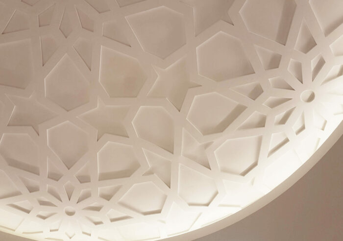
Throughout Discovery, we were drawn to the Islamic geometry that is distinct to the region. While this felt too ornate and dated, we turned to more modern geometric patterns as the basis of a distinct and ownable brand element. We adapted these designs into an interactive, generative system of three-dimensional geometry that separates the ADIA website from other institutions.

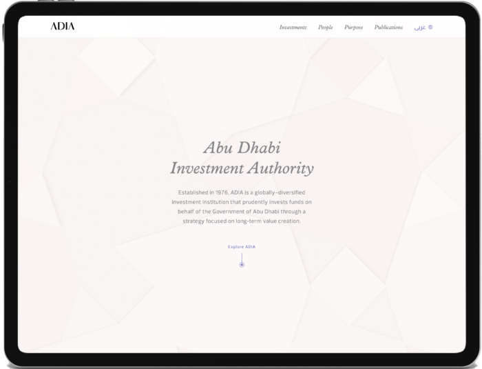
Built through WebGL, this base system of three-dimensional geometric patterns is used in a multifaceted way throughout the website. It provides the structure of the website, acts as container for website content, and informs the overall tone of the site through subtle background animations.
Motion that mirrors meaning
MotionThe animation of geometric backgrounds across the ADIA website is crucial to capturing the brand’s elegance and wisdom. The graceful tempo and bespoke colour variations revealed through these animations not only complement the content but lead the user’s eye through the page. Here, motion reveals the intricacy of the geometric compositions, as light and shadow bring the essence of the ADIA brand to life through the very fabric of the site.
New ways to navigate
Interactive ScrollADIA didn’t want their site to feel like any old financial institution website. We wanted to embody the ADIA brand not only through the visuals, but the mechanics of the platform. To do this, we imagined navigation across the site as similar to a bird flying over a landscape.
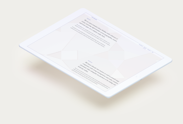
Responsive to the user’s scroll, the camera movement transitioned between islands of content scattered throughout the page. This mirrored ADIA’s focus on the big picture, while creating the feeling of a choreographed, deliberate journey through the site.
To execute on this vision, we combined our 3D geometric scene created in WebGL with 3D CSS positioning of content. This allowed us to move the camera along a path, rather than straight down the page, without compromising accessibility and SEO. We also used bespoke javascript code to facilitate the geometry’s response to user input through scrolling, touch, mouse movement and button presses.
Concise narrative, necessary detail
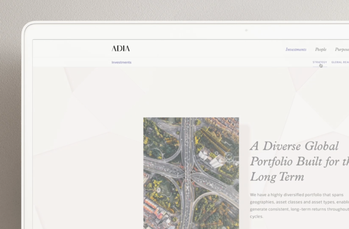
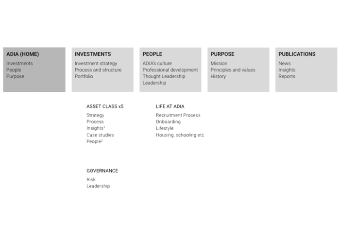
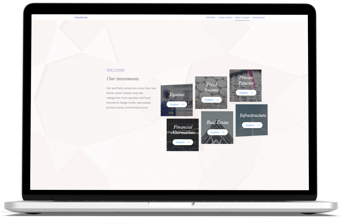
Content StructureWhen it came to content structure, our goal was to build a cohesive narrative throughout the website; to tell the story of ADIA in a way that was both accessible and insightful. At a structural level, this meant fewer, more concise pages. Top level pages were used to highlight ADIA’s core offering, while subsequent pages were only added where necessary. At a content level, this meant refining the message; reducing copy to short, deliberate paragraphs and pairing these with carefully considered imagery.
Subtle yet meaningful movement
CinemagraphsWhen it came to sourcing the imagery for the ADIA website, we focused on finding visuals that would not only relate to the content, but enhance the tone of the site. Static images would help capture the scale and diversity of ADIA, but couldn’t capture the force that propels the organisation forward. Meanwhile, video content would provide this sense of motion, but without the focus of a single image.
The solution was cinemagraphs; visuals where small elements remain in perpetual motion while the rest remains static. This allowed us to maximise expansive imagery while incorporating smaller details that hint at the energy driving ADIA forward. The subtle motion also encouraged users to go back for a second look, digging deeper into the details that separate ADIA from the crowd.
Balancing beauty + clarity
Data + InfographicsThe breadth of information of ADIA’s diverse portfolio provided a unique opportunity to position the organisation as an industry-leading source of knowledge for stakeholders. Our initial experiments explored how we could use geometry to tell the story of data, or making graphs that emerged from the background. While this approach was beautiful, it did hinder the navigation of information and the apparent accuracy of the data.
Instead, we decided on a more modern, precise approach based on three core principles. The first was centred on the beauty of data. We worked with ADIA to find intelligent patterns that would make beautiful yet meaningful graphics. Our second principle was that information should be clear, using thin lines and sharp points to ensure ease of consumption. Finally, we wanted our graphics to be descriptive. Here, we used bold, contrasting colours to focus the user’s attention on important details and insights.
Accessible yet elegant translations
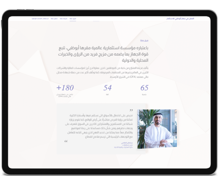
Multiple LanguagesTowards the end of the development process, we were to make the ADIA website accessible in Arabic as well as English. While this might not seem like a significant change, the fact that the two languages read in different directions meant it would affect not only content but layout.
Luckily, we were able to account for this without having to redesign the website. We did so by serving two different stylesheets, such that an Arabic css was generated from the original English css. We then added custom translation code into our production build tool chain to override font preferences and reverse the direction of positions, box layouts, text alignments, transports.
Building implementation systems
DeploymentAn important part of our process is the implementation of what we create – whether that be an experience, web platform, program or exhibition. For ADIA, this process began with a beta prototype of the website, allowing us to collaborate with them on the ideal amount of content, pages and media across the website.
We were then able to extract this content into a dynamic data structure managed through the Kentico CMS. This gave us both the flexibility needed for iteration, as well as the security, performance and robustness required for a large government-backed organisation like ADIA.
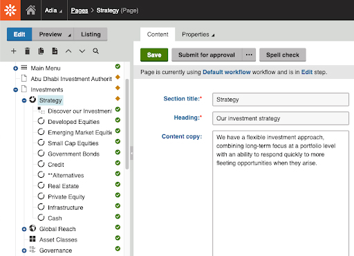
One of the biggest benefits of this approach to deployment – as opposed to using a more customisable CMS like WordPress – is security. With the CMS functioning as a separated application, we no longer needed to anticipate public access. This meant that we could implement more security measures in the architecture level, from a firewall with IP whitelisting to a private DNSW record.
Planning for the future
AnalyticsFor us, the work doesn’t end on project launch. We’re committed to learning in everything we do. And that means taking the time to reflect on where we’ve come from, and reassess where we’re going. In addition to general maintenance of the ADIA website, we built in a number of data and analysis mechanisms that would allow us to iterate on and expand the site based on user behaviour. This included monthly reports with UX and UI recommendations, as well as website performance metrics across browsers and devices to ensure that the experience functions as intended.
Industry-leading website design
Site LaunchWith approval from His Royal Highness, the new Abu Dhabi Investment Authority website formally launched in 2020. An innovative yet elegant application of emerging web technologies, the site demonstrates how websites can now go beyond simply communicating information. They can provide an experience that tells a compelling story, captivates audiences and embodies a company’s ethos for the rest of the world to see.

Stay in the loop
Subscribe to our newsletter to receive updates and insights about ADIA Website and other S1T2 projects.


