Perth Festival
Dynamic event website development seamlessly integrates CMS + ticketing.
- Perth, Australia
- +500ksessions
- 56%increase in online sales
Aiming to create a more compelling experience for Perth Festival patrons, we worked with For the People to design and develop a new, responsive website for the brand. A bold step forward in the Festival’s ability to address patrons’ needs, the website development prioritised user-friendly design and intuitive functionality, progressively learning from user’s interactions to offer personalised content that was both familiar and surprising – just like the Festival itself.

More than a booking site
The BriefIn line with a bold brand refresh by design agency For The People, Perth Festival was looking for a new website. They didn’t want any old online directory or booking system. This would be a comprehensive guide to the Festival, an experience as engaging and dynamic as the event itself.
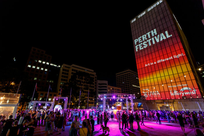
In developing this website, our goal was to create an online experience that felt alive with possibility. We wanted to craft a website that not only made exploring Perth Festival and booking tickets simple and intuitive, but that also learnt from visitors as they engaged, providing personalised recommendations that would expand their experience in exciting and unexpected ways.
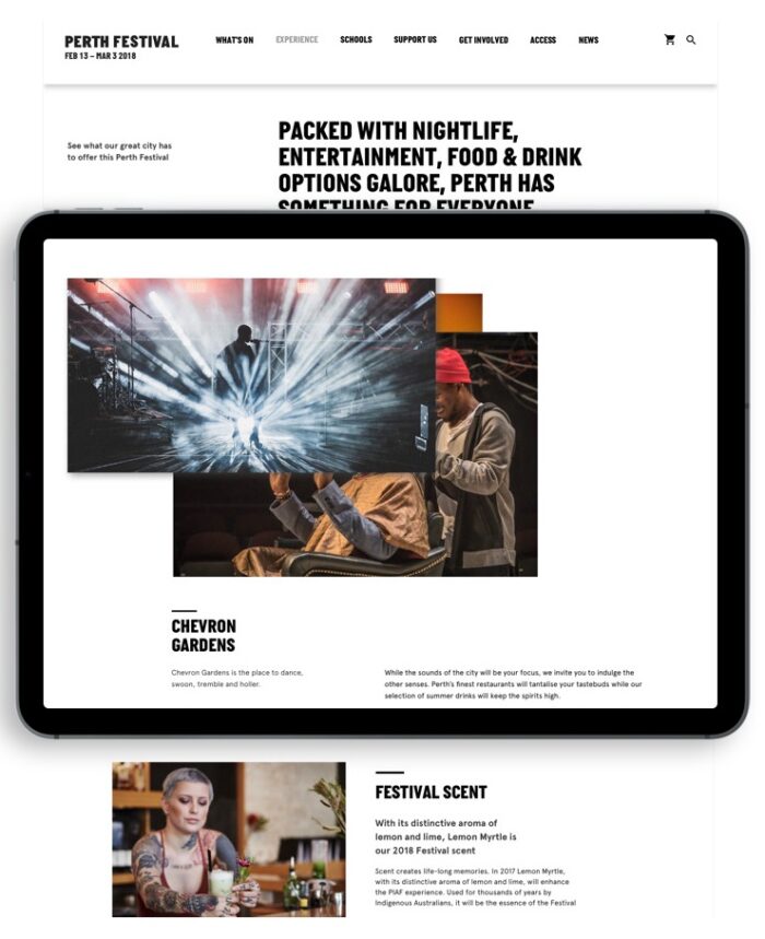
Development extends design
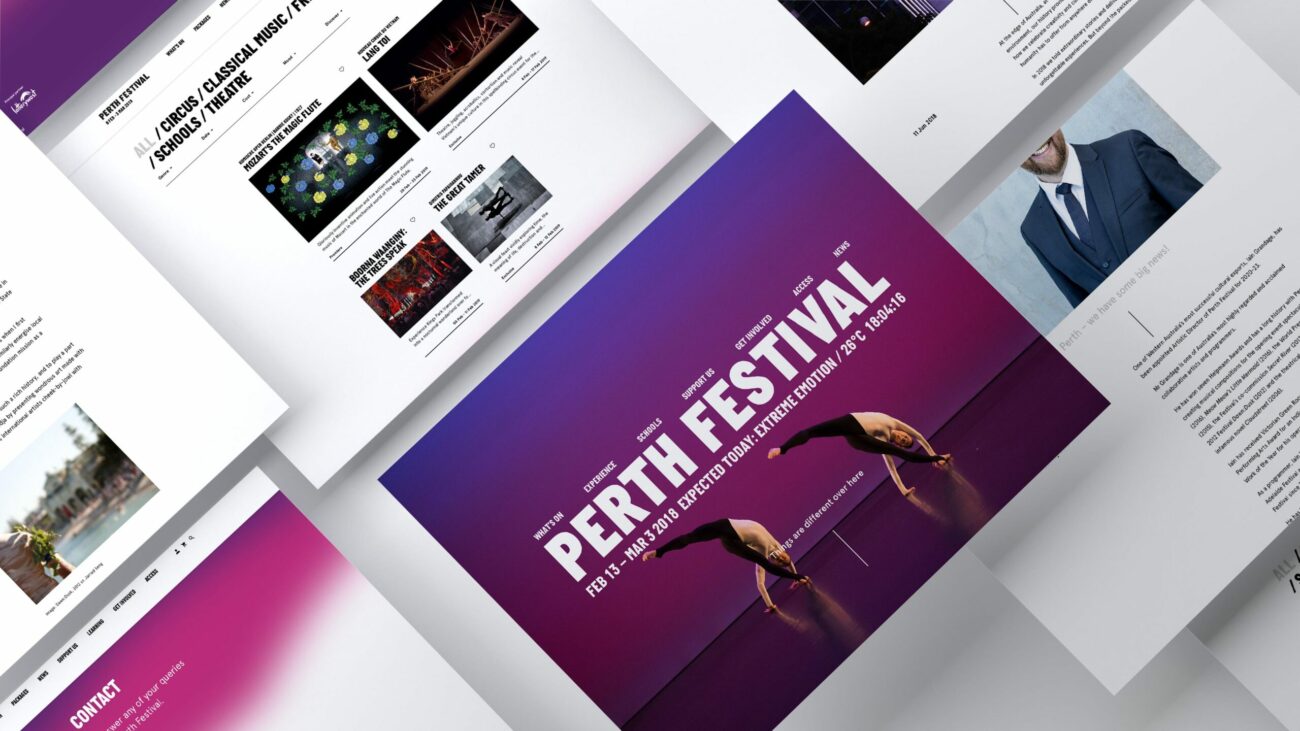
InteractionFor The People's strong design direction gave the Festival a bright, bold visual identity that made it easy to extend their design metaphors into website development. Take the design’s reliance on colour washes representing Perth’s legendary sunsets. We were able to transform this design element into subtle interactive features, from sunset backgrounds that evolve as you scroll to a colour scheme that changes depending on the time of day.
Personalised recommendations
RecommendationsThe website design placed a strong emphasis on photography and videography, with copy intende to play a supporting role of ‘local tour guide’. This approach gave us the opportunity to present recommendations from the website itself in a way that felt organic and natural for users.
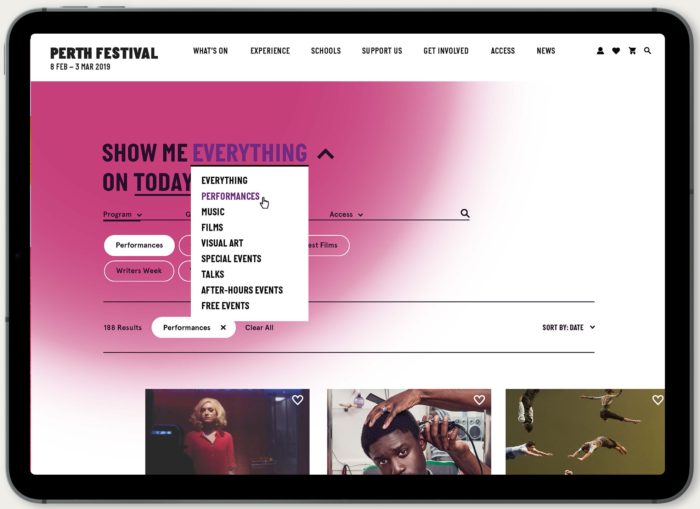
With intuitive functionality prioritised at every step of the website development process, the site listened to users, progressively learning from their interactions. This information was then used to better guide users through their Perth Festival experience, presenting them with personalised content that was both familiar and surprising – just like the Festival itself.
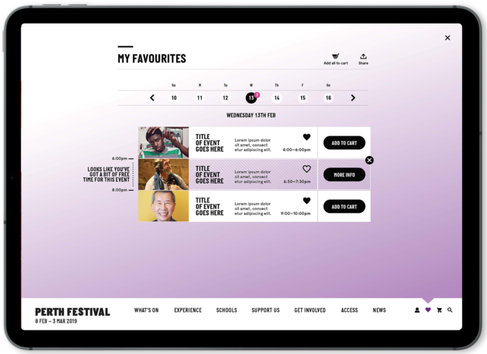
Custom experience builder
Personalisation
Alongside the recommendation system, we also developed a customisable ‘experience builder’ to help patrons to design their own events packages. This choice – to treat the Festival as a whole rather than a collection of events – was key to increasing conversion rates. Foregrounding personalised engagement, the tool blended intuitive control with serendipitous suggestions to expand patron’s online and offline experience in new and interesting ways.
Streamlined user experience
TicketingWhile the Perth Festival website was intended to be more than a simple booking site, facilitating ticket purchasing remained a key requirement. That said, we didn’t want this functionality to be an afterthought. Our goal was to make the purchase of tickets and ticket packages a simple and intuitive part of the overall user experience.
To achieve this goal, we developed a deep integration between the website and the Festival’s existing ticketing system and ecommerce platform Tessitura. This choice empowered the site’s innovations in user experience, providing a more intuitive and intelligent experience for users able to browse events and purchase tickets with ease.
Fostering meaningful connection
Social IntegrationDesigned as a bold expression of the Perth Festival brand, we wanted this website to feel alive while helping to facilitate a more comprehensive, connected Festival experience. Key to this was implementing seamless integration with key social media applications throughout the website development process, allowing for easy and meaningful social sharing.

We also implemented a system through which visitors could connect with one another while planning their Perth Festival experience through shared lists. This feature allowed users to design an experience that took into account not only their interests but also their friends and family, bolstering the Festival’s goal of bringing people together to interact with art in new ways.

A new platform built to last
Architecture + CMSIn line with the brand’s adaptable design system – which was able to transform from application to application – we built this website to last. With a robust website architecture, solid content management system, and alignment with AAA accessibility standards, the website development supported an improved experience for staff and patrons alike – one that will be able to change and adapt for years to come.
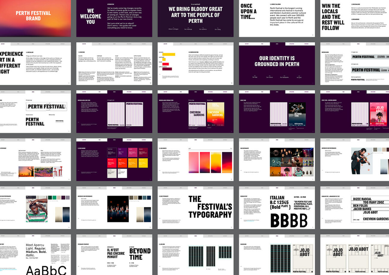
An innovation in online sales
ResultsIn its first five months, the refreshed Perth Festival website had over 480,000 online sessions. While this represented a 22% decrease in sessions from the previous year, it supported a 56% increase in sales through the website itself. These results demonstrate the website’s ability to support a more positive online purchasing experience for patrons.
These results also confirm the effectiveness of our innovations in website development and user experience. The addition of personalised recommendations and tailored, visitor-built experience packages not only played a key role in increasing cart size, but created a website that became an elegant, simple and compelling Festival experience in its own right.

Stay in the loop
Subscribe to our newsletter to receive updates and insights about Perth Festival and other S1T2 projects.


