
Archer Website
Future-focused website design using the latest in online visualisation.


As Archer Exploration expanded their mineral resources business to include material research and integration, they needed to communicate this new venture online. Together, we created a refreshed brand, digital direction and website able to articulate their dedication to innovation. Breaking with the conventional industry formula, the Archer website tells a story of the future through a data-inspired aesthetic, dynamic scroll interactions and cutting-edge WebGL visualisations.
Visit the websiteFuture-focused rebrand
The BriefWhen mineral resources company Archer Exploration expanded into material research and integration, they didn’t just want a new website. They wanted a complete brand refresh that would allow them to better communicate their future-focused vision to existing and potential investors.

In developing their new brand, we sought to bring together all aspects of the business into one unified offering. Leaning on a futuristic aesthetic and cutting-edge WebGL, the associated website would not only communicate but embody Archer’s commitment to innovation.

A more cohesive brand
Art DirectionArcher’s mission is to develop and integrate advanced materials into the technologies of the future. Our revised branding aimed to reflect the clarity and decisiveness of this vision, bringing together the disparate aspects of the business – which spans exploration, mining, materials and technology – into a cohesive brand platform.


Innovation-inspired aesthetic
BrandingWhile giving a subtle nod to the company’s history in the mining sector, the revised branding and website design positioned Archer as a leading voice in advanced materials. With the subtle symbolism of an arrow reflecting the brand’s clarity and precision, the new logo prioritised a bold visual identity tempered by the simplicity of being able to recognise a brand by its name.

Taking inspiration from the earth and sky, our colour palette paired dark navy blue with a vibrant orange accent. In doing so, it not only brings together the concrete reality of mineral exploration with the speculative future of technologies, but reflects how Archer adds a spark of human innovation to the materials that will define our future.

Meanwhile, the brand’s bold typography presents clear, readable text that prioritises a tone of confidence and clarity key to attracting new investors. Strong, geometric accents throughout the brand and website design then provoke a futurist aesthetic, helping to inspire confidence in a future that’s waiting to be made.

Evolving visualisations
Website DesignOnce we’d nailed down the brand direction, the next step was figuring out how to translate it into the digital world. As the core expression of the brand – online and offline – the Archer website design needed to be simple and easy to use while embodying the company’s future-focused vision. We didn’t just want to convey facts and figures, but to communicate the ethos of the brand through digital design and interactivity.
As the initial website roll out would include just two pages – a homepage and an investor portal – we were able to invest in creating a bespoke, interactive WebGL visualisation to tell the story of materials technology. Housed on the homepage, the visualisation grows and changes as the user scrolls, taking advantage of the brand’s tech aesthetic to abstractly represent each facet of the company – from exploration, to extraction, and finally integration.


Computationally cheap, visually compelling
WebGLCreating these background visualisations in WebGL allowed us to imbue the Archer website design with depth and intrigue through dynamic three-dimensional renders. It also helped us to craft seamless transitions and maintain continuity between each visualisation as the user scrolled. Meanwhile, the simple, bold brand and technology-focused aesthetic ensured the WebGL renders were computationally cheap, resulting in a website that is both visually satisfying and lightweight across browsers and devices.
Growing with the brand
GrowthFor the initial roll out, we kept the Archer website very simple, focusing instead on high-quality execution and communicating a strong brand voice. While in the short term this allowed us to build and launch the website quickly, in the longer term it also helped to establish a pipeline for effectively scaling the website design and development as the business grew
The combination of a simple website build and strong brand aesthetic paved the way for us to add new pages quickly and integrate each new element into the overall story of the site. Whether adding a simple pulsing visualisation of the materials lifecycle or incorporating a periodic table motif, each new page becomes part of the larger story of Archer’s progress.

See more projects
Explore projects similar to Archer Website.
-
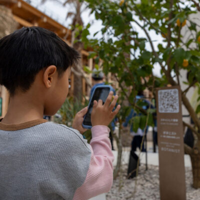
The Botanist AR
Interactive web-based AR turns waiting into a moment of discovery.
-
Malek Fahd Islamic School
Crafting a new story for Australia's largest Islamic school.
-

Game Winning Drive AR
Volumetric augmented reality brings football legends to your living room.
-
ChildFund Swipe Safe
A world-first web safety program using story + technology.
-

Hume Bank Website
Brand refresh + reimagined website design redefine a regional institution.
-

Menulog Baller Banquet
Gamified loyalty program transforms food delivery experience.
-

Queensland Remembers
Interactive WebGL website dedicated to those who serve.
-

Athena
Home loan website boldly reimagines how we interact online with WebGL.
-

Perth Festival
Dynamic event website development seamlessly integrates CMS + ticketing.
-

A.L.I.C.E. Cyber Security Game
Retro-inspired mobile game educates about cyber security.
-

Blackmores Well Bot
AI chatbot kickstarts conversations about health at the Australian Open.
-

Test Your Loan
Home loan website uses financial history to tell an interactive story.

Stay in the loop
Subscribe to our newsletter to receive updates and insights about Archer Website and other S1T2 projects.