The clear path forward
It’s hard to keep up with the design industry constantly shifting. Frequently emerging technologies and methodologies leaves techniques you used yesterday becoming obsolete today. In those instances, I rely on the foundations to give me a clear path forward.
Similar in theory to Gestalt’s Principles of Perception, there is a set of four design principles —C.R.A.P. — and it’s much easier to remember. The principles of designing C.R.A.P. is by applying Contrast, Repetition, Alignment and Proximity. Using these at the most basic level of your work can be the quickest way to see improvements. And because it’s all ties in closely with perception, it has the flexibility of being applied to all types of design. I’ll be formatting text with the principles as an example.
C for contrast
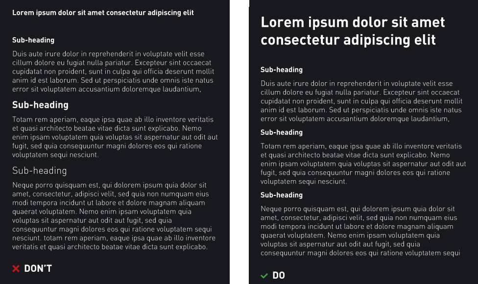
Otherwise known as the mythical “pop”, “pizzazz” and “life” that your design seems to be missing. In graphics, it’s the bright colours and textures; in copywriting, it’s the exclamation mark; in typography, it’s the bold weight. Contrast is stimulating and should be used sparingly because in order to create contrast, certain elements stand out only when others fall back.
The practical application of C.R.A.P. begins with determining hierarchy in the design.
- Deconstruct elements of the design into the order of importance
- Identify consistent elements and apply a consistent formatting to them
- Make elements that aren’t similar, very different

Headings stand out with contrast when paragraph text is toned down.
R for repetition
Repetition in this context is synonymous with ‘consistency’ but C.R.A.P. is catchier than C.C.A.P. so let’s stick with Repetition.
The human psychology has an innate ability to recognise patterns. Therefore, aim to ‘repeat’ similar elements in style or format to be consistent for information to be efficiently processed and understood. Repetition can be applied to messages, sounds and colours. It will help reinforce organisation strength and unity in the mind of your user and is the reason why strict brand guidelines exist.

Repeat formatting of headings and subheadings for efficient scanning.
A for alignment
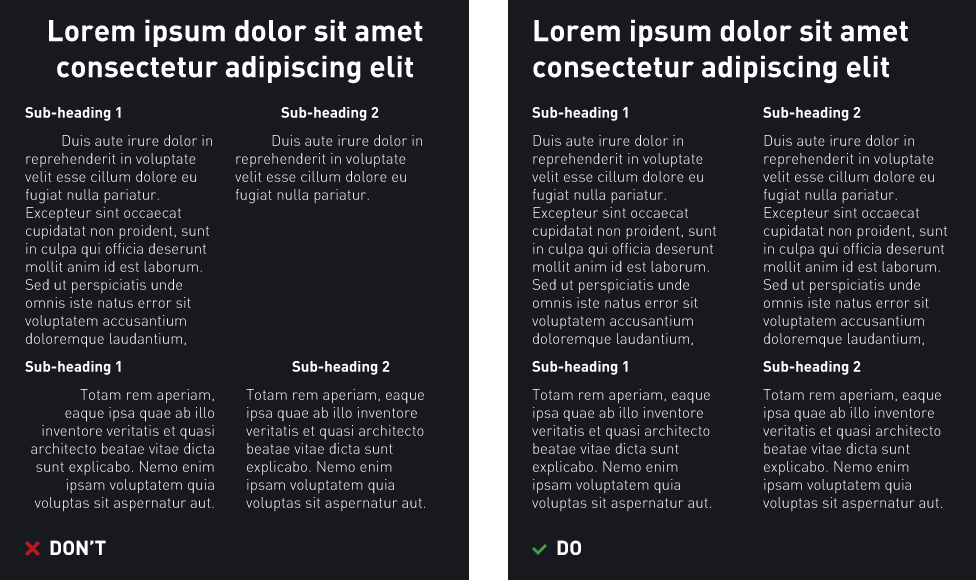
Create visual connections by aligning elements with each other. In Gestalt’s Principles, this would be classified as a facet of ‘continuity’. When elements follow a single baseline, human sight will visually perceive a psychic line. This can be used to draw attention from one point to another, unify common elements and develop consistency across designs.

Align relevant headings, body copy and images to the same baseline.
P for Proximity
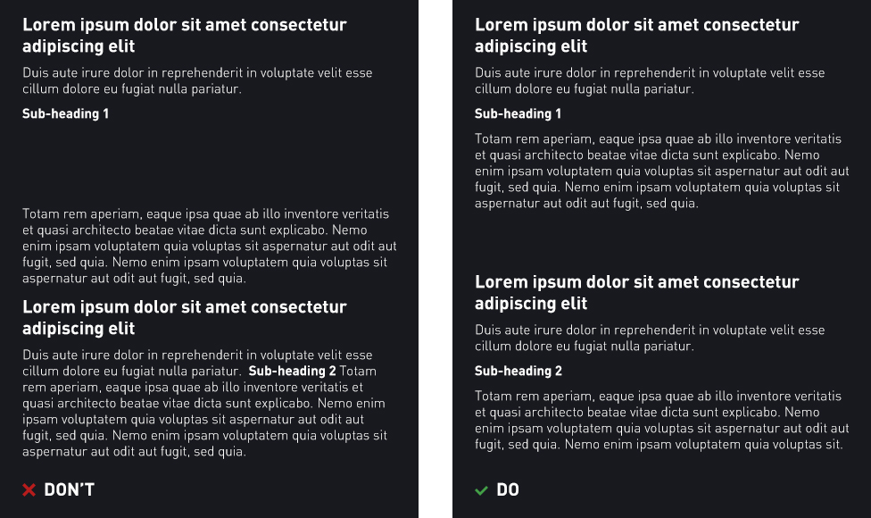
Position common elements in close proximity to avoid confusion and create relevance. This way, they become a visual unit and ultimately helps organisation while reducing clutter. Similarly, elements that aren’t related should be further apart.

Position common elements in close proximity so they appear as a cohesive group.
And to finish…
For further reading on rules of perception in psychology, give Gestalt's Principles a read. Apply or assess existing design with the principles of C.R.A.P. to give you a fresh perspective on how to approach problems regardless of the context.
As we forge ahead, while we imagine what might be, we must rely on our guiding principles, our intentions, and our goals.
If you're interested in the world of design, you can also check out this article about the most important skill to master when starting out. You can also check out these principles in action within some of our recent web work such as the Protect the Snowies, RoomFood and Brownmen&Co websites.


